Two Point Oh
November 1, after nearly 4 years with our previous site, we proudly launched the second major version of our online home.
When we created the original site, our goal was to make a minimal geometric portfolio that didn’t feel like every other minimal geometric portfolio out there. With a handful of clients and a bit of development knowledge, we hacked together a site that at the time felt unique and fun.
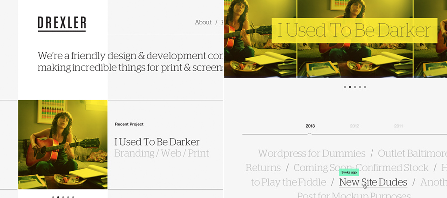
Drexler 1.0 received a good amount of attention from industry publications and blogs, and received mentions on a few “45 Agency Sites with Bright Color Schemes and Nice Grids”-esque posts. While we were happy to see it getting noticed (and copied), the limitations quickly became clear. But with a huge influx of client work, we never seemed to find the time to work on our own site. Our company was growing, but our site was only growing more outdated.
As these limitations and frustrations became more clear, they naturally grew into our major goals for our next site.
Those goals looked something like this:
- Make it bigger, bolder, simpler
- It should be easier to write and publish articles
- We need the ability to add more text for projects
- It has to be responsive in a smart way
Not surprisingly, these are the same principles that guide our client work.
After many failed kick-off attempts, we finally started work on the design for version 2. We thought (and debated) a lot about what a work portfolio should be. What it should feel like. What people should think of Drexler after visiting the site.
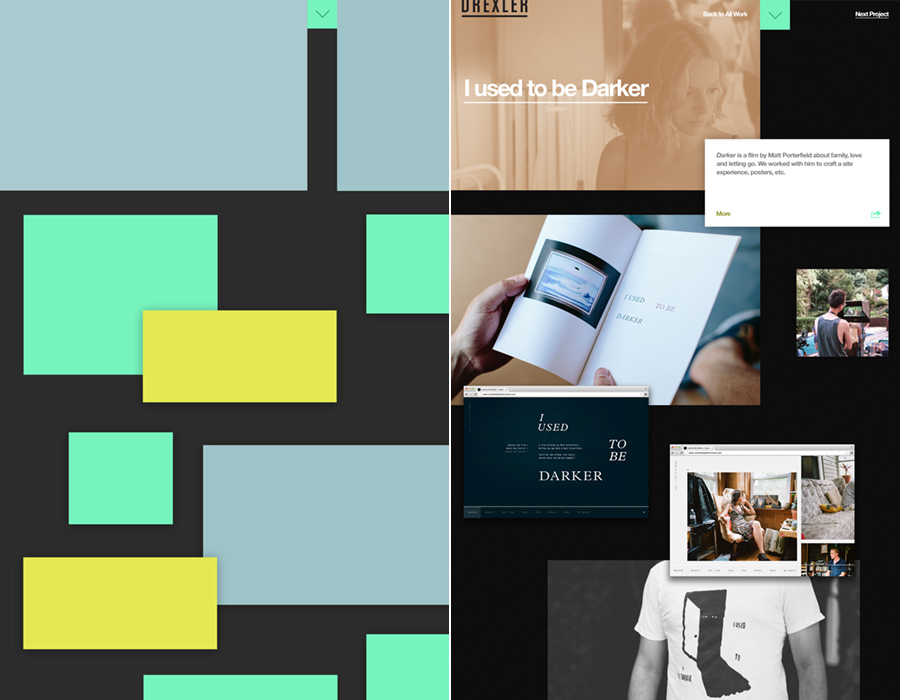
But, like any design project worth its salt, we unanimously agreed that the site should center around the content. We eventually landed on a design that was bigger and bolder, yet restrained, and allowed the content to shine.
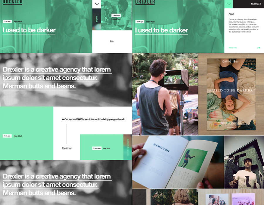
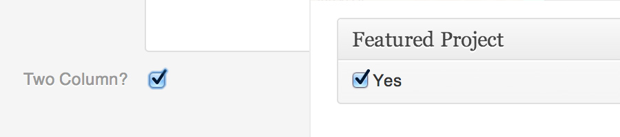
As with 90% of our sites, the site is powered by WordPress. We like to think we’re pretty handy customizing WordPress and set out to make it as streamlined as possible. We baked in some custom features that make maintaining our portfolio much easier and reduce the friction of posting articles.
To keep things smooth and fast, we’re using Ajax to load in content and CSS to power the animations. But instead of just fading in and out the entire page, we’ve split the animation to load the main content and the sidebar independently. An early animation loading concept is shown below.
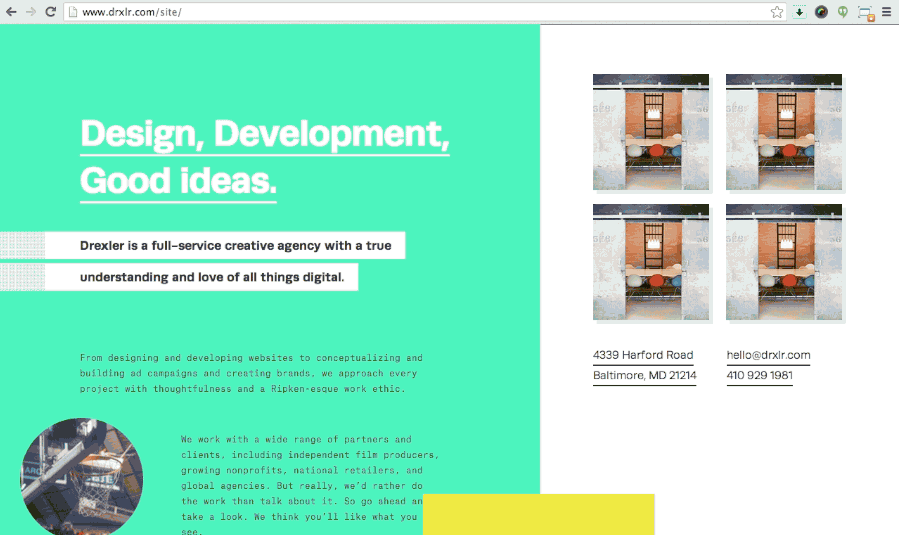
We’ve also tried to make browsing an easy process with keyboard navigation, preloading select images, and having additional information show up contextually. Finally, we made the site fully responsive on the desktop, and, of course, optimized for mobile browsing.
We think this site represents who we are now and hopefully gives a preview of where we’re heading in the future.
Up Next: WhizBack to journal.